Just after we put our last issue to bed and announced a week off, the the City of Austin came out with its new logo. At first I thought it was a joke when I saw former Council Member Mackenzie Kelly say online that it was about to happen. But, no. Within moments Kelly was proven to be accurate, including on the cost figure that she mentioned, $1.1 million.
The breaking news got a lot more serious shortly after that with an Austin cop shot and wounded in Zilker Park and the person who shot the cop also shooting his own girlfriend in the back of the head. Of course there’s no conviction yet, but that is what is charged and it sure looks like that’s what happened on the police video. Right wing activist Charlie Kirk was shot and killed later the same day. There was also news about increases in car burglaries at popular Austin spots like Mt. Bonnell and the hike and bike trail with police saying they make arrests, but those arrested are often not charged and then go and break in cars again. We’ll tie all the local parts of this together in future stories. The one that seems the least serious is the City logo, but still it’s worth taking a look, especially since it is scheduled to go into effect very soon, on October 1.
One of the most amazing aspects of the logo story is the timing of the announcement. City Manager T.C. Broadnax picked September 4 to unveil the new logo, exactly three weeks after the Mayor and Council voted to call a tax rate election for November (except for Marc Duchen who voted no). In that election voters will be asked to increase property taxes by 5 cents per $100 evaluation, which would result in an overall property tax bill increase of around $300 on the “typical homeowner.” We will examine issues in the tax rate election in upcoming articles, with voters making the call on November 4.
Up to now Broadnax has been probably the quietest City Manager in modern Austin history. That’s not necessarily a bad thing. I mean that’s just the approach and philosophy of some City Managers. It’s absolutely fine, even welcome in some ways. For one thing, up until recently it looked like Broadnax might be quietly and methodically working to right the ship, and that he just doesn’t make a lot of public statements.
But then came a bump in the road. The Austin American-Statesman and KVUE reported that Broadnax, who makes $488,800 a year, had charged about 150 lunches to the City for a total of $3,300. That’s not a lot of money in the grand scheme of things, but it doesn’t look good when the City Manager makes almost half a million per year, the City is in a budget crisis, and the Council is asking voters to increase their property taxes beyond the state annual limit.
Next Broadnax evidently decided to come out of his shell and make a big splash speaking debut by announcing the new logo. He held a press briefing where he announced:
“Two weeks ago I shared some exciting news with 17,000 City of Austin employees. And that news is that the City will be getting a new look. For the first time in Austin’s history we will have a logo to represent the City services and unify as one organization and one Austin.”
Broadnax continued, “While this effort began before I arrived as City Manager it is a project I was glad to champion because there is a very real business need for a unified brand. We want our community members to be able to identify members of our team as City of Austin employees and trust the services we provide. Whether they see the brand on a website, a utility bill, a street sign, or the side of a vehicle, they’ll know exactly who it’s from and what it stands for.”
A press release featured the exact same quote as above from Broadnax, but then added, “What will not change are the uniforms of the Austin Police, the Austin Fire, and the Austin—Travis County Emergency Medical Service (EMS). It is important for Austinites to trust and recognize their public safety responders.”
Well, which one is it? Does the City of Austin need a new logo so when citizens “see the brand” they will “know exactly who it’s from and what it stands for?” Or do they need to leave the logo off of police, fire and EMS uniforms because “it is important for Austinites to trust and recognize their public safety responders.” This doesn’t make any sense.
After all this I’m no longer thinking that it’s a good thing, or even acceptable, that Broadnax is quiet. I think the Mayor and Council Members need to check in with him during meetings and ask him what he’s thinking.
The Big Unveiling
Broadnax also explained that there are currently “over 300 logos representing various departments, services and programs,” which “leads to confusion for the public, which can dilute trust in the services we provide and create inefficiencies in how we do business.”
The 300 different logos is probably Broadnax’s strongest argument. But, note that he says the 300 logos come from various departments, services and programs. So this would count individual programs within City departments that have their own logos and some of those programs may no longer be operating. Some people opposed to the new logo design are not necessarily against a new logo, period. We asked the City for the list, but did not hear back by press time.
Austin City Manager T.C. Broadnax unveils Austin’s new logo – screenshot from City website
The manager then explained, “Our new brand was shaped by feedback from a diverse cross section of community members and City employees. In surveys and focus groups, with a wide array of community members, Austinites told us that they value and appreciate their interactions with City staff. But, they also want a modern government that reflects community values and is consistent, connected and responsive across departments and services. And that’s what this brand does.”
“In surveys and focus groups . . . Austinites told us that they value and appreciate their interactions with City staff. But, they also want a modern government that reflects community values and is consistent, connected and responsive across departments and services. And that’s what this brand does.”
Austin City manager T.C. Broadnax
Well, maybe but to this trained ear it seems like another City of Austin community involvement/public input process where the answers came out suspiciously close to what City staff and consultants had in mind in the first place; and even features jargon amazingly similar to that used by staff and consultants [here’s another example].
Also, as someone who has participated in local government and written about it for several decades, when I think about dilution of “trust” in City government or wanting a “modern government that reflects community values” a new logo is not anywhere near the top of my list of solutions.
Logos of Dallas and Austin. According to materials from the City of Austin the new logo, “It’s more than just a letter. With flowing lines that echo the movement of our rivers, the curves of our hills, and the dynamic energy of Austinites.”
Then there’s the fact that Broadnax took the job after a tenure in Dallas. Well, the new Austin logo looks suspiciously like the Dallas logo and it took over a million dollars to get there. I doubt that Broadnax said, ‘hey, let’s just use a logo that looks like Dallas,’ or that he thinks that Austin wants to be more like the bigger City up the freeway that he rode down here from. But, it’s still worth making sure Broadnax knows that Austin has long seen itself as very different than Dallas or Houston. We love them, usually, but we’re not the same, and we don’t want to be. If that philosophy has changed then City leaders should let us know.
Save the Austin Energy Lightning Bolt ad Does Anybody Remember Ben Franklin?
Then there are the City’s utilities, in particular Austin Energy and Austin Water. They are really major publicly owned businesses and they transfer a considerable portion of their profits to the City’s general fund. Shouldn’t they, like the public safety departments, be allowed to keep their own logos and branding? Here we will focus on some history in regard to the Austin Energy logo.
Back in the late 20th Century, when I was elected to the Austin City Council (1996), Austin Energy’s logo included a lightning bolt, as it does now. Actually the name Austin Energy didn’t exist back then. What is now Austin Energy was just called the Electric Utility Department or Austin Power and Light.
Austin electric utility logos before it became Austin Energy
This was during the era that City and utility officials were proposing to sell the electric utility. By the time I got there the sale effort had been largely derailed and utility officials were instead looking to rebrand, or just brand. Part of that was getting a new logo. Utility officials, with consultants on board, came to the Council with a proposed new logo. They had removed the lightning bolt that had been part of the logo for decades.
I liked the lightning bolt because it relates to the discovery of electricity and specifically harkens back to Benjamin Franklin’s experiments with electricity.
The proposed new logo was brought forward at one of my first Council work sessions. I objected to the elimination of the lightning bolt and I got some support from other members of the Council. Within a few days utility leaders came forward with a compromise logo that included a lightning bolt. It was created by a staff member at the utility named Bob Jones.
Current Austin Energy logo created in the mid-1990s by Austin Energy employee Bob Jones
Jones, a graphic designer, created it two years earlier when the utility first started considering a new logo. When the consultants arrived they passed over Jones’ logo. After the objections from Council Members to the elimination of the lightning bolt the consultants and utility management brought Jones’ design forward. We adopted it and it has been Austin Energy’s logo ever since. (By the way another part of the rebranding at that time was changing the name of the utility to Austin Energy, a recommendation of staff and consultants. That was a good idea and has stood the test of time.)
Ben Franklin and Lightning Bolts
Let’s also briefly review Benjamin Franklin’s history with lightning bolts and electricity. In his 2003 Franklin biography Walter Isaacson succinctly summarizes that history, “He (Franklin) proved by flying a kite that lightning was electricity, and he invented a rod to tame it.”
In a Franklin biography published in 2002, Edmund Morgan described how Franklin made his big scientific breakthrough. Morgan described how Franklin wrote a paper on his theories about electricity “in a volume published in London in 1751, which was immediately translated into French and published in Paris the next year. In it he suggested an experiment that would place a long pointed iron rod from the top of a tower or steeple ending at the bottom near a charged glass tube. If a spark passed to the tube during a thunderstorm it would prove that lightning was electric. French scientists, following his instructions, tried the experiment successfully about a month before Franklin conceived the simpler experiment with the kite. Suddenly he was famous.”
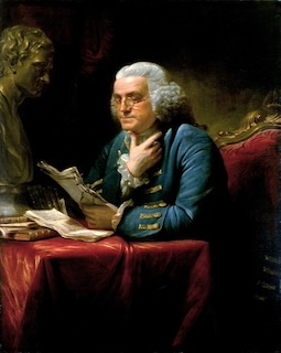
A 1767 painting of Benjamin-Franklin by David Martin; from the White House Historical Association via Wikipedia Commons
So, Austin Energy’s current logo was created in the mid-1990s by an employee of the utility without any assistance from consultants. It also paid tribute to one of the early scientific leaders in discovering the properties of electricity, that being Ben Franklin — who later became a Founding Father of the United States, and who also tried to persuade the first Congress to eliminate slavery.
The logo has served Austin Energy well as it rose to become one of the leading utilities in the world, a longtime leader in conservation, use of renewable energy, and in providing breaks on their bills to low income customers. And, they did it all as a public utility, owned by the citizens of Austin.
Back at the time the logo was chosen the Austin American-Statesman published a story about Austin Energy employee Bob Jones who designed the logo. Therein Statesman reporter in Laylan Copelin wrote that the City spent “as much as $16,500 in payments to the consultants” before turning to Jones’ design. Copelin also wrote that Jones said he was “flattered” that his design was chosen. The article ended by quoting Jones, “It’s one of my lifelong dreams to have something on the (city) vehicles. A living legacy after I’m gone.”
Photo by the Austin Independent of an Austin American-Statesman article from 1996 reporting on the origin of Austin Energy’s new logo, created by Austin Energy employee Bob Jones.
Well, too bad Mr. Jones. You had your design on vehicles, buildings, websites and stationary for a few decades, but that’s over now; no lasting legacy for you. Instead the City of Austin is going to replace those logos on vehicles, remove them from buildings, delete them from websites and order new stationary with a new wavy-A logo.
At least Bob Jones is in good company. The City of Austin is cutting out Ben Franklin too. Come to think of it Franklin may not be that popular in today’s Austin either, except on $100 bills.
$1.1 million?
The Austin American-Statesman published a breakdown of the $1.1 million cost that they obtained from the City. According to the Statesman, the biggest share of that was a $576,000 contract with Pentagram, an international firm based in London, but with an Austin office. That contract was approved in May 2024 by a unanimous vote of the then Council, including Mackenzie Kelly. The Statesman added, “City staff later later executed a $76,000 contract with TKO Advertising (an Austin based firm), which did not require council approval because it was under the $100,000 threshold (for City Manager approval as opposed to requiring a Council vote).
The Statesman then detailed another $477,558 that is being spent on the logo endeavor:
- “$115,000 for a “public awareness campaign”
- $75,582 for “consolidated citywide design software for all departments”
- An estimated $100,000 for “foundational materials” (apparel, business cards, posters, banners, flags, badge holders for all employees)
- $186,976 for salaries and benefits for “support staff and legal counsel.” This includes a temporary “brand project manager” and external legal review.”
This totals just over $1.1 million and “doesn’t include the cost of placing the new logo on trucks, uniforms and other assets.” A City spokesperson told the Statesman that that will occur ‘“as physical assets like uniforms and vehicles reach their end of life.”’ But, the logo will begin appearing on the City website and other electronic and graphic venues beginning October 1.
Austin Logo immediately made news in industry media
The new logo immediately became the subject of praise in the branding industry media; yes there is such a thing. On September 5, the day after the logo was announced, the “Fast Company” website featured an article titled “‘The ultimate design by committee’: How Pentagram crafted Austin’s new logo.”
The Fast Company article reports, “According to Pentagram partner DJ Stout, the process was a balancing act of creating an identity that was both authoritative enough for the city government and representative of the average Austinite.” The article then points out, “Already the result is generating a firestorm of negative attention on social media—but Stout says that’s ‘completely expected’ in today’s divisive branding reaction ecosystem.”
The article explains, “Stout is unfazed by the backlash, which he says has become a side effect of working in the industry over the past several years. He points to Pentagram’s work on Hillary Clinton’s presidential campaign and his own rebrand for Loyola Marymount University as two examples of design efforts that received intense pushback when they first debuted but have since been recognized as solid identities.” (I don’t think you can blame the logo, but I still have to ask, “how did Hillary Clinton’s campaign turn out?”)
According to his bio on the Pentagram website, “Stout is a sixth generation Texan, born in the small West Texas town of Alpine.” He began his “graphic career” in Dallas then in 1987 moved to Austin to become art director of Texas Monthly. According to multiple online reports, he left Texas Monthly in 1999 and hired on with Pentagram in 2000. There, according to his Pentagram bio, Stout’s “wide-ranging expertise encompasses the design and redesign of a variety of publications including magazines, books and catalogs. He and his team also specialize in identity design, branding, packaging, exhibitions and website design.”
According to Fast Company, Stout was inspired in large part by the Save Our Springs movement and Austin’s love of water. It was also a labor of love for him, “I’ve been a partner (at Pentagram) for 25 years—this is not one of the higher-paying jobs. I did it because I love this city, and because I’m from the city, and it really means a lot to me.”
That may well be, but what Stout — and apparently the branding/logo industry — don’t appear to consider even a remote possibility is that they could come up with a bad logo, or one that doesn’t really reflect its subject, in this case Austin. Instead intense opposition and criticism — especially on social media — is now written off as just a given when a new logo is unveiled. Soon, according to industry thinking, that opposition will fade and the logo designers will have been right all along.
__________________
Folks: Local, independent journalism is very poorly funded. That is definitely the case with the Austin Independent. Please consider subscribing and/or donating. It will help us, for example, to expand our readership base and to pay for important public information requests To subscribe or donate, click here. Funds we receive will be used primarily to try to increase our readership base.
To receive notification when the Austin Independent posts stories, to subscribe, or to write to the editor please send us an email under Contact on the home page,or click here.
The Austin Independent, a publication of The Austin Independent, LLC
All Rights Reserved